Short Answer: BLUE
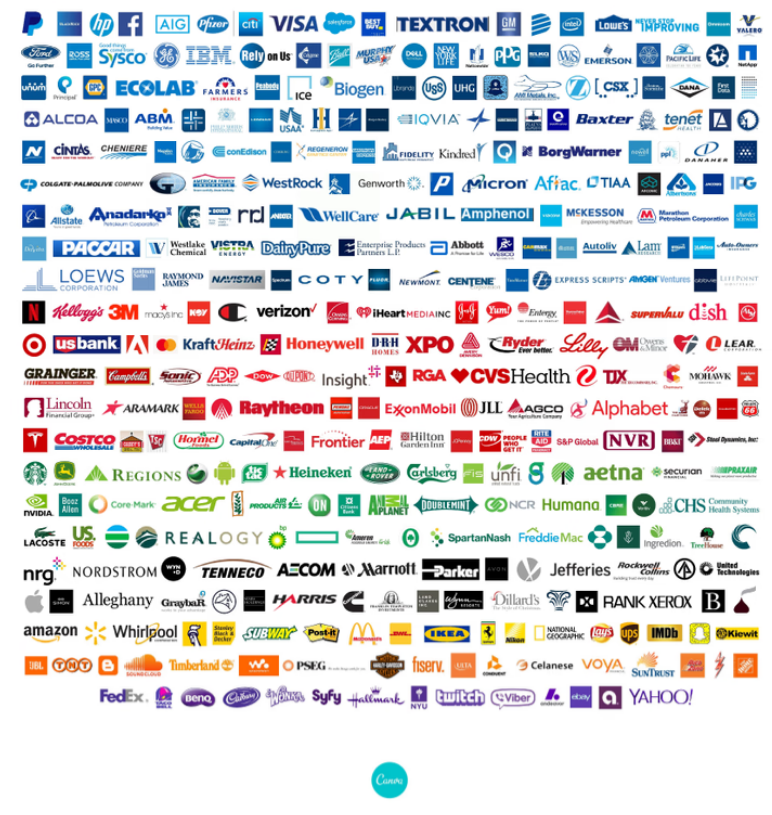
Blue is the most popular color used within top brands. The majority of Fortune 500 companies use blue because it’s considered steady, loyal and trustworthy.
Canva did some research a few years back and created this breakout showing blue leading the way:

As a solopreneur, if you want to stand out, don’t make that common mistake and use the same blue a top company uses.
That’ll certainly help your brand become forgettable—and possibly sued for using their trademarked blue.
While there are millions of blues to choose from, the blues most big corporations use are rather similar…and boring.

If you want to stand out as an authentic, heart-centered business that is aligned with your overall essence, then it’s critical you start aligning your brand colors with your own personality and coloring.
Use your power colors
When I work with solopreneurs, I always do a session where I pull key symbols and colors, as well as put together a color palette for them to refer to that feature their personal power colors.
The big reason is: colors that align with you as an individual, also need to align with your brand.
Whether you’re speaking in public, holding an important meeting, hosting a course or getting your headshot done, knowing your Fearless, Inspiring, Uplifting, Trusting and all the ones in-between (there’s 16 specific power colors) will help you to come across authentically.
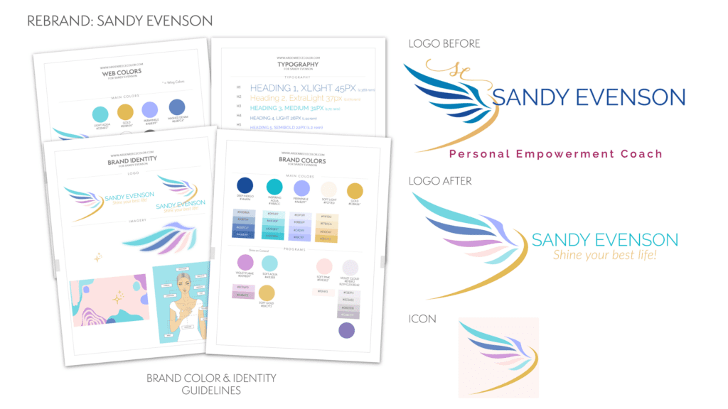
For example, here I show a client’s “before” logo using the corporate blue and her “after” logo which features her personal power colors.
It’s much more authentic and aligned with who she is.

Color is a visual way of communicating who you are without saying a word. And, with waning attention spans, it becomes even more important that you use the right colors that describe your business. That’s what makes you and your brand stand out. 💯


