Last updated on March 30, 2021
Color is the greatest stimuli we receive from the outer world. Not only do we create meaning via color associations, color provides us energy and helps keep our bodies running.
Light (aka color) is absorbed and reflected by our hair and skin creating important natural sunscreen and coloring; it enters our eyes, activates vision, affects our circadian rhythm, our metabolism, our cortical activity, and parts of our autonomic nervous system (heart rate, blood pressure) …..it has profound biological and psychological effects. So obviously, we need color to live.
Yet, many of us don’t see color…instead we sense and feel it (technically, our brain creates color.)
Color Communicates to you via your senses
Imagine yourself sitting on a warm, sandy beach with your toes in the sand. You are warm all over just enjoying the warm sun on the warm sand…what color are you feeling? Red? Orange? Yellow?
Now, envision yourself in the most beautiful and pristine snow white mountains. The air is crisp and your fingers and nose feel cold. What color are you feeling now? Ice blue…blue-violet?
Color provides us guideposts to what we’re sensing and experiencing in life. When color doesn’t feel right or look right, we feel off-balance.
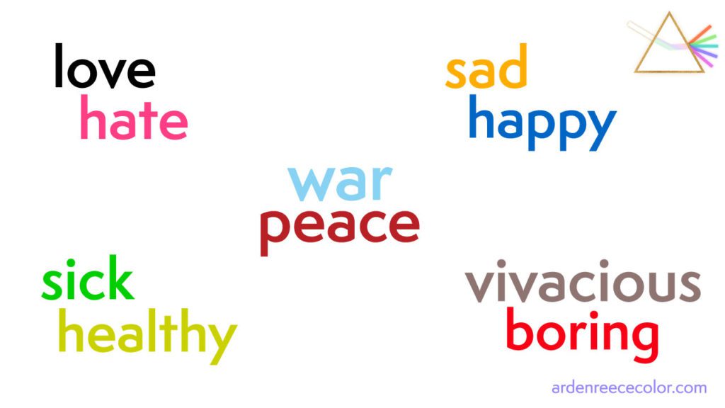
Just take a look at the words below. I purposely associated them with their opposite color meaning so that when you read them, you sense that something is off… they seem in-congruent.

Color Associations of key emotions
When researchers ask participants what color is most associated with Peace, they hear blue…worldwide, regardless of language or socioeconomic background.
When they ask participants what color is most associated with Hate, they hear black as well as a deep, dark red. That feels right, doesn’t it?
The word War is similar in that it is seen as a deep, dark red in representation of blood.
So viewing the word “war” in a peaceful blue and “peace” in a deep, dark red as shown above feels off-putting. These disharmonious color choices for peace and war hit the heart….’this is wrong’, you feel. These words you show us feel wrong.
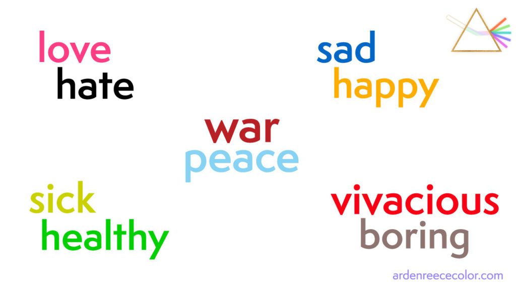
Studies show that most folks associate the word Happy with yellow or orange. And when you’re Sad, you have the blues, thus a deep dark blue is associated with sadness and depression.
Other words associated with unique colors that are not so much indicative of emotions but rather current states of being are:
- Sickness: typically a yellow-green, phlegm-like color
- Healthy: associated with green
- Vivacious: associated with red and red-orange
- Boring/Bored: associated with grays
Now, when viewing the words and their correct color associations below, the color message resonates.

How You can overcome fear and gain courage with color
Most of us are not conscious of color. It slips by us. What I’ve realized after working with thousands of clients is that most people don’t live their lives using color as a guidepost. And I’ve also heard from many that that COLOR SCARES YOU.
Most of us don’t feel comfortable drawing attention to ourselves and so when we wear color (meaning a color from one of the hues in the visible spectrum), it does the exact thing we are NOT COMFORTABLE with…having others notice us, look at us, maybe even SEE us.
Trust me, I get it. I am known to pull the black top on a cold day because it’s comforting and warm for me since black absorbs all color (light) and heats up quite nicely. It’s easy, it’s ‘effortless’, it’s sophisticated. But it can be a lazy way out of being present if my intention for the day is counter-intuitive to the color I’m wearing…like wearing a red dress when I’m feeling peaceful and content.
As you move through life, think of how color is supporting you and your energy. When you’re feeling peaceful, wouldn’t it be wonderful to have the right blue around you to support you?
Or, you could flip it: if you’re feeling down (blue) and don’t want to, surround yourself or wear YOUR happy color…this will turn your mood so that you are more aligned, like the words and their associative colors above.
Using color to Support you
There are MANY meanings to each of the colors – both good and bad – and when you discover YOUR best colors, it makes it easier to use them to form connections and be courageous.
I think about how I form connections as well as how I stand up for myself (even when deep-down I’m afraid) and color has always been there with me…through my Approachable & Trusting colors to my Fearless and Heart colors.
So my challenge to you is simple yet daunting because you have to mentally get over the hurdle of having others SEE you…of the fear of being exposed and feeling vulnerable. I think Brené Brown, who has researched vulnerability, shame, courage and worthiness says it best:
"Vulnerability sounds like truth and feels like courage. Truth and courage aren’t always comfortable, but they’re never weakness."
Brene Brown
Knowing that you can use color to support you and give you strength helps you to move forward in living wholeheartedly…and hopefully less fearful of color altogether.
Whenever you’re ready, there are 3 ways I can help you:
- 1. Gain greater clarity and understand your soul’s purpose here.
- 2. Draw on the deeper mysteries of color for healing and transformation here: colormysteryschool.com
- 3. Work 1:1 with me to grow your authentic presence or online brand.
Join Creative, Soul-Led Entrepreneurs Growing Their Authentic Presence.
Every Thursday morning, you’ll get 1 helpful tip on creating alignment and using color energetically for your personal & professional growth.


