Last updated on March 28, 2021
How good are you at communicating the differences between the color Larchmere, Dynamo and the color 325C? (These are color names from Sherwin-Williams and Pantone.)
When you understand how to speak color as the color industry does, you’ll have an easier time getting your message understood.
Like most paint suppliers and color formula purveyors, colors are given a name or set of secret-coded numbers that leaves us guessing.
Even when it comes to colors such as Light Pink, Battleship Gray, Turquoise, Magenta or Royal Blue…what do these colors REALLY look like?
Although the language of color sounds complicated, it doesn’t have to be. By using the three dimensions of color (hue, value, chroma), it is really easy to communicate what a color is accurately. But how?
Enter Albert Munsell.
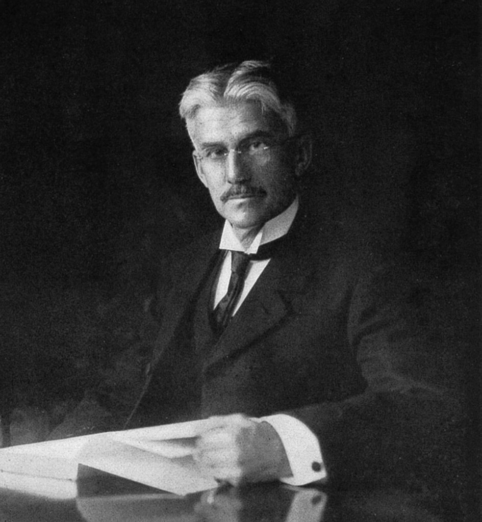
“Delightful and necessary as are our color sensations, they leave very imperfect images, because the memory has no system for their identification.”
Albert H Munsell, 1904 (Munsell Diaries)
Munsell created a notation system that was presented to M.I.T. in 1904 and thereby published his work, “A Color Notation: A Measured Color System, Based on the Three Qualities Hue, Value, and Chroma,” in 1905. In it, he writes:
“The incongruous and bizarre nature of our present color names must appear to any thoughtful person. Baby blue, peacock blue, Nile green…are popular terms, conveying different ideas to different persons and utterly failing to define colors.” He goes on to state, “Not only are they inaccurate: they are inappropriate….Color needs a system.”
So, this artist, teacher, and color-name-anarchist created a notation system that is now well over 100-years old and is the most internationally accepted color notation system we have today. So why aren’t we using it in the mainstream?
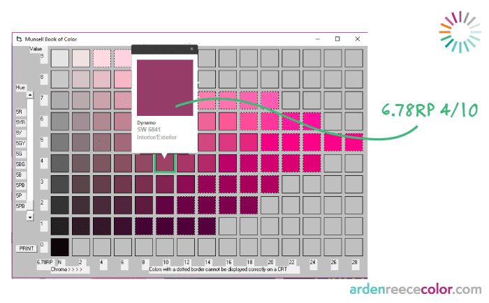
Maybe 6.78RP 4/10 isn't as sexy sounding as Dynamo
When I refer to the Munsell notation, I know that Dynamo is in the Red-Purple hue family (sitting at 6.78 of a 1-10 scale) and that it’s value is rather dark (4 in a 1-10 dark-to-light scale) and that it’s chroma (a 10, right in-between being dull or bright) is somewhat rich. Yes, I know it’s not as exciting as the term, Dynamo, but I can communicate color and you’ll be able to see what I mean.
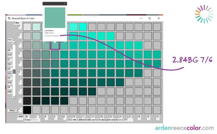
When you can speak color accurately, you no longer have to wonder
The Munsell notations speak clearly and they’re super easy to understand and communicate once you get the 3 attributes of color down.
When you refer to the Munsell notation, you know that 2.84BG 7/6 is a light & soft blue-green versus wondering what Larchmere looks like.
My dream is to have the mainstream—all of us—speak this language so there is no room for misunderstandings when it comes to color.
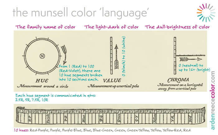
So, How Do You Speak Color?
Here’s a handy little chart to get you started in understanding the 3 dimensions. The pictures are from Munsell’s book “A Grammar of Color” with my notes in color.
The Notation in 3 Simple Steps
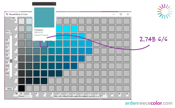
Let’s use 2.74B 6/6 as an example. Or as Sherwin-Williams calls it, Freshwater.
(1) Write down the Hue initial with the number of where the color is within the hue (1-10 for more accuracy or 2.5, 5, 7.5, 10)
- 2.5B is a blue that is closer to B-G (blue-green) so it has more green in it versus a 10B which is closer to a Purple-Blue.
- Because I used a colorimeter and the Munsell Conversion software, I got an accurate read of 2.74B
(2) Add the Value # after (1 for darkest dark, 9 for lightest light…0 and 10 are reserved for black and white)
- The color is not dark nor is it super light so its definitely in the mid-range. A 6.
Then add the “/”
(3) Then add the Chroma # after the “/” (0 for N-neutral and in segments of 2 from dull to bright)
- Freshwater is a rather subdued, soft color but not super dull. 6 is just right.
Also check out Munsell’s post on how to read the Notation here. The most difficult part of speaking this language is calibrating your eyes so you know what a 1-9 value is and how the chromas can change. Red can have really high chroma numbers whereas blue won’t….it’s just the nature of color.
If you want to test your color acuity, there is the Farnsworth Munsell 100 Test which you can take for free.
And if you want to see and work with 200 of the Munsell colors, check out my Personal Color Cards set.

